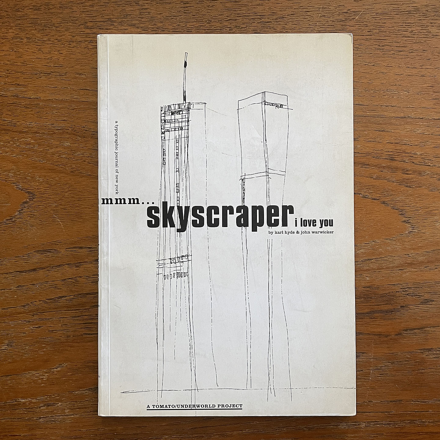
Mmm…skyscraper i love you: a typographic journal of New York
John Warwicker & Karl Hyde, 1994
Reviewed by Maggie Brosnan, A24 (BFA+BA)
A typographic journal of New York City, Mmm…skyscraper i love you playfully and chaotically layers the geometry of its typography to reproduce the pulsating hum of a city in motion. Upon first encountering the book's cover, it would be natural to assume that the book’s imagery is illustrative, a roughly drawn image of the twin towers the only visual information provided beyond the title. These once iconic, yet now absent, visual signifiers of the New York City skyline are emblematic of the book's theme, but do not reflect the visual style of the rest of the book. When opened, it becomes evident that Mmm…skyscraper i love you is a chaotically experimental typographic exploration of urban multiplicity and understanding.
Released in 1994, the artists’ book is a collaboration between designer John Warwicker and electronic musician Karl Hyde, spanning the worlds of audio and visual communication and producing a multifaceted sensory experience. The design and production of Mmm…skyscraper i love you formed part of the developmental process of the album Dubnobasswithmyheadman, which was released by Karl Hyde’s electronica band Underworld alongside the book (click here to listen to the track titled Mmm…skyscraper i love you on YouTube). Both projects were produced under the British creative group Tomato, which has overseen a multitude of creative and commercial cross platform, multi-media art and design projects since its formation in 1991.
As a designer, John Warwicker’s creative identity has always been defined by a keen interest in the expression and boundaries of typographic images, made evident through his other book projects The Typographic Mind and The Floating World. His collaboration with Underworld continued beyond the release of Mmm…skyscraper i love you; Warwicker continued to design album covers and concept art for the group, eventually collaborating with them on another book project called In the Belly of Saint Paul.
Both Mmm…skyscraper i love you and its accompanying song on Dubnobasswithmyheadman by the same name draw their text and lyrics from Karl Hyde’s stream of consciousness writing. Passages do not flow easily into one another—rather, the text seems to jump, skip, and layer in tandem to its accompanying electronic album, the book’s rhythm unpredictably repetitive and uncomfortably laminous. With the exception of a few hazy, dreamlike photographs which emerge at the book’s climax, all of the interior imagery of Mmm…skyscraper i love you is developed through heavily manipulated typography and bold, abstract shape and line. A stark black and white color palette references the aesthetics of newspapers and cheap publications, further imbedding the work into the fast-paced, information driven context of New York City. The text’s conceptual collection and geometric, interlaced arrangement infuses the book with an architectural, cubist sensibility. The disorderly design of each page pushes the boundaries of legibility, sparking a generative contrast between the abstract and the decipherable, infusing the work with a multiplicity which accurately reflects the chaotic collectivity of city life.
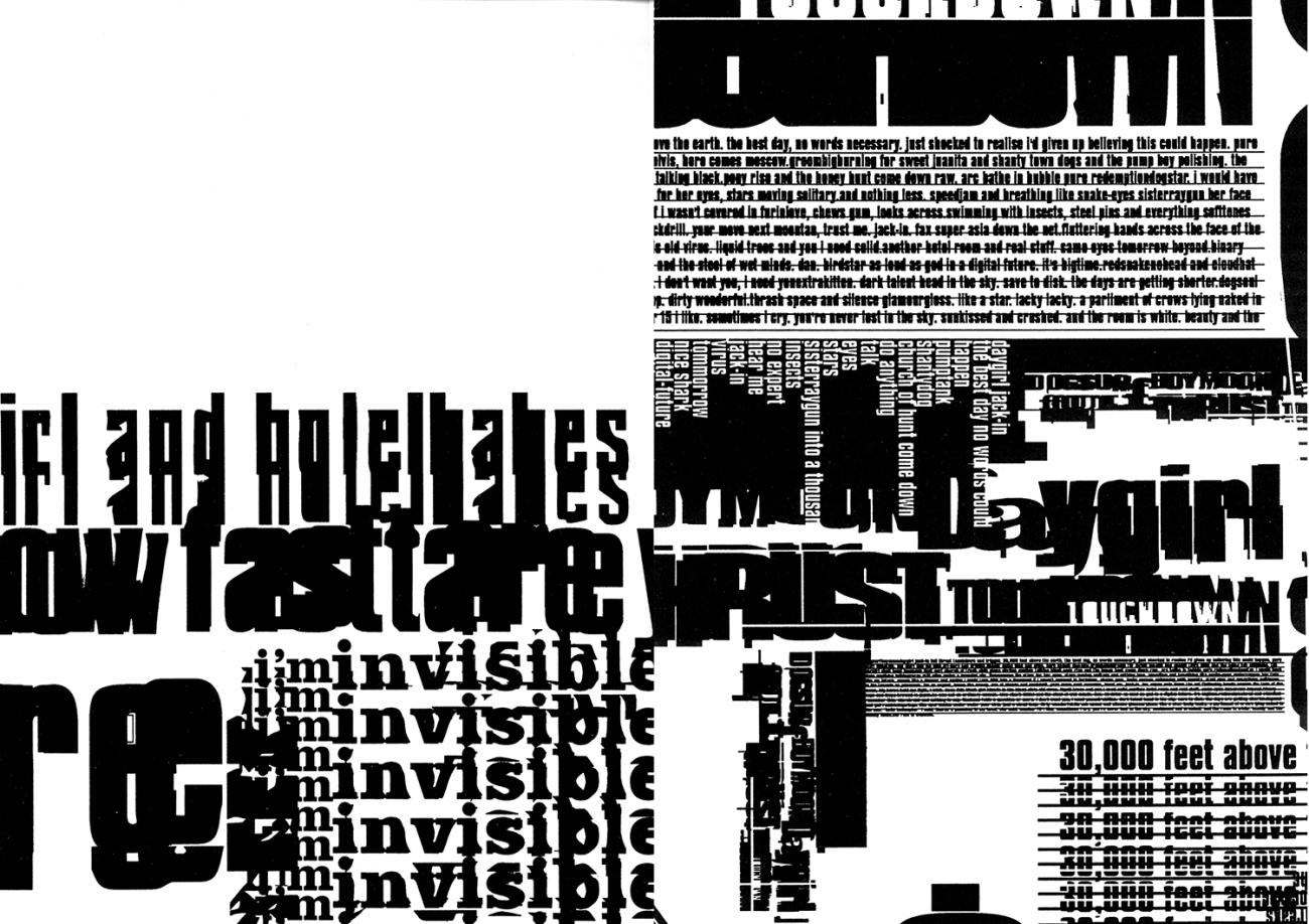
On certain spreads, the reader is overwhelmed by an influx of typographic information. Competing levels of readability work to establish a hierarchy of importance, but the text’s meandering, observational dialogue and intense repetition work to undermine this very hierarchy. Despite the inherent geometric logic of the page (much like the grid of New York), the reader is overwhelmed.
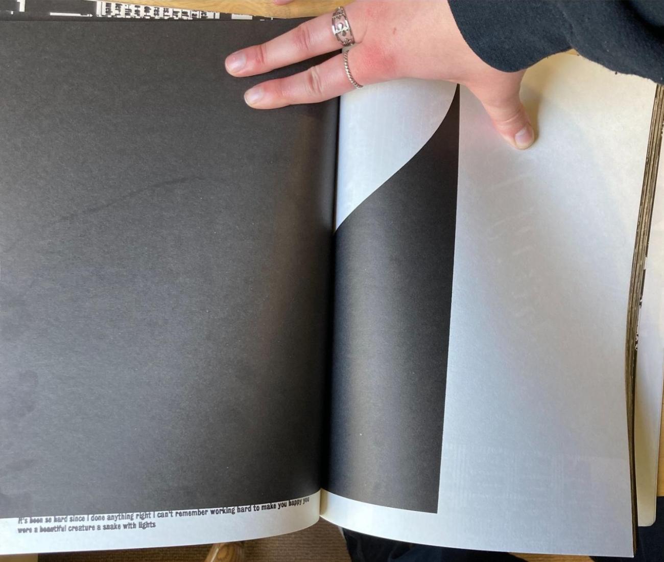
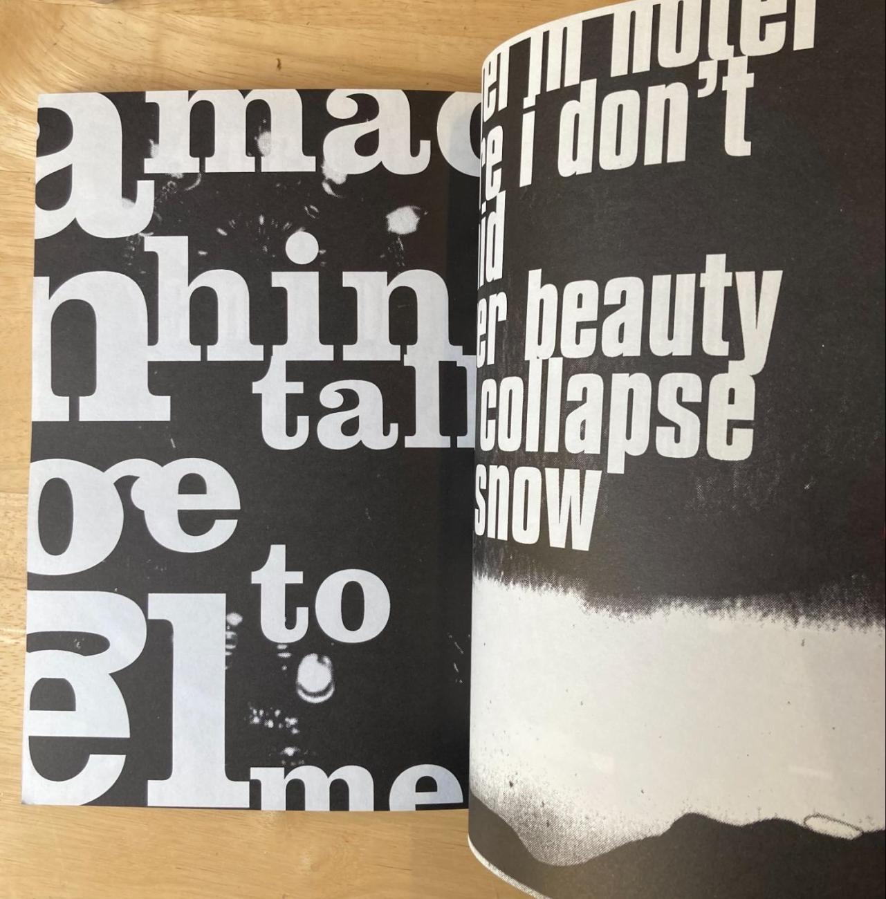
In comparison to these typographic tapestries, other spreads are shockingly minimalist. These pauses in the book’s humming, persistent rhythm are still highly designed, but offer a rare moment of clarity. Unlike other spreads, the simplicity of these moments reveals the melancholic nature of Hyde’s writings; it’s 4am, the city falls silent, and for the first time in what feels like hours, your head clears.
Warwicker’s design certainly stands apart from other books released around the same time. The proliferation and accessibility of vector-based design is likely what influenced Mmm…skyscraper i love you’s wildly expressive typography. While vector graphics had been around in the 1960s, it was not until the 1990s that digital tools began to dominate the design world. Adobe’s vector-based design platform, Illustrator, was released the same year Tomato published the artists’ book. The book’s chaotic aesthetics also reflect increasing interests among designers in deconstruction in the mid ‘90s. These deconstructionist approaches to typography and layout were largely influenced by early 20th century futurist aesthetics.
Mmm…skyscraper i love you is wildly experimental not just in its arrangement and layering of typography, but also in its broad selection and implementation of different fonts. Transitional serifs, clarendons, grotesque sans serifs, and scripts appear over the course of the book's 288 pages. In some cases, these different font faces are used to signal the beginnings and ends of the books roughly defined ‘chapters’, and artificially create a sense of forward motion and transformation within a book which is aesthetically consistent. For the most part, however, this diversity in font works to contribute to the book’s multiplicitous hum. Although the voice of the book is technically that of Hyde, these constantly varying font faces, combined with the text's repetition and layering, work to create the sense that the contents of Mmm…skyscraper i love you are emerging from the diverse collective mind of a city. The singular narrator is replaced with a city’s worth of voices.
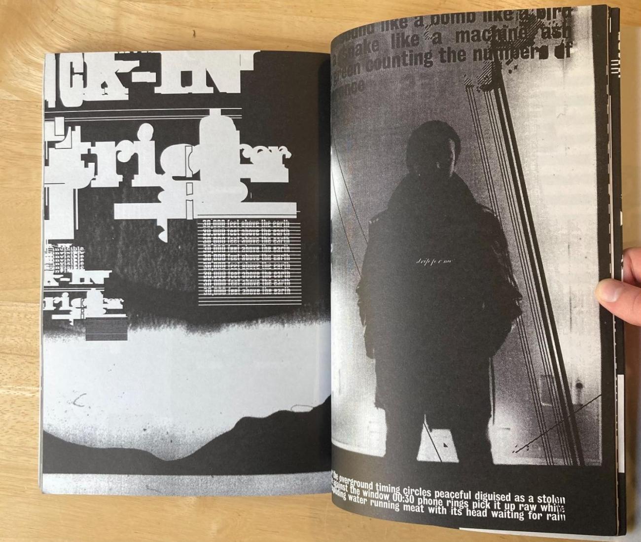
One of the most powerful sequences in the book occurs during its climax, when photographs are substantially introduced to the work for the first time.
The images are brought into the book's context slowly and carefully. First, the grainy halftone which obscures these images is introduced on the first spread, masquerading as another one of the book’s geometric design elements. The soft dither of the black box’s edge distinguishes this spread from previous pages.
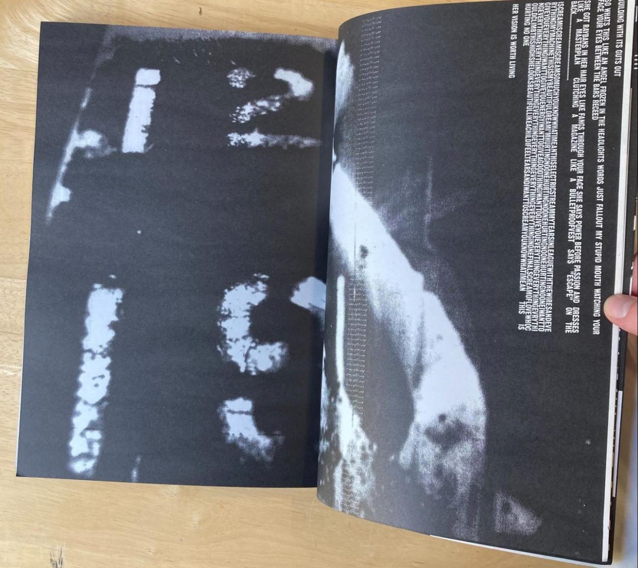
Slowly, images are introduced, beginning first with photographs of numbers to transition from the book’s exclusively typographic imagery.
Finally, the most distinct images of the book appear: a backlit man silhouetted against gray clouds (the book’s first significant appearance of gray or a midtone), accompanied by the stark parallel stripes of telephone lines, which reference earlier imagery in the book.
Mmm…skyscraper i love you is perfect bound, and far from a short book. Consequently, the construction of the book makes it impossible to lie the book flat on a table without seriously endangering the integrity of the book’s spine. As a result, elements of the book’s carefully curated typography are sometimes lost in the spine, which unfortunately impacts the reading experience. Beyond the binding, the book is softcover with uncoated interior pages. As an object, Mmm…skyscraper i love you is not particularly luxurious or remarkable, yet in some ways this construction speaks to the book’s interior text, which often works to dramatize the mundanity of city life.
Mmm…skyscraper i love you can still be purchased from major online realtors, and appears to still be in print, indicating a great deal of long-term success. Some of this is likely due to the project's associations with a popular music group, but the continued interest in the book speaks volumes to the power of typographic and linguistic experimentation. Mmm…skyscraper i love you has encouraged me to seek meaning beyond narrative in my artists’ book work, and possibly explore the pursuit of more abstract text without distinct rhythm or conclusion in my own work.
Related books in the library collection
I am dogboy
Karl Hyde, 2016
The floating world: ukiyo-e
John Warwicker, 2008